In today’s competitive job market, your resume is a crucial tool to showcase your skills, experience, and qualifications. However, for individuals with color vision deficiencies—commonly known as colorblindness—certain color choices on a resume can make it difficult to read or interpret the content. As part of creating a resume that is inclusive and accessible, it's important to consider the needs of those with color vision deficiencies. In this blog post, we’ll explore colorblind-friendly resume design tips to help you create an accessible and legible resume that works for all audiences.
Introduction
Color blindness, or color vision deficiency, is a condition that affects a significant portion of the population. According to studies, approximately 1 in 12 men and 1 in 200 women have some form of colorblindness. The most common types are red-green color blindness, blue-yellow color blindness, and total color blindness. When designing your resume, it’s essential to understand that not all readers perceive colors in the same way. In fact, relying on color alone to communicate information could create barriers for colorblind individuals. This guide provides practical tips on how to design a colorblind-friendly resume that is clear and accessible to everyone.
Why is a Colorblind-Friendly Resume Important?
Ensuring that your resume is colorblind-friendly is not just a matter of being inclusive—it's about making sure that your resume is accessible to all potential employers and hiring managers. A resume that isn’t accessible could result in missed opportunities, especially if important information, like skills or qualifications, is hidden behind problematic color choices. A colorblind-friendly resume enhances readability and ensures that key details are easily distinguishable, regardless of the viewer's ability to perceive certain colors. Whether you're applying for a job in a corporate environment, creative field, or tech industry, an accessible resume reflects a thoughtful and professional approach.
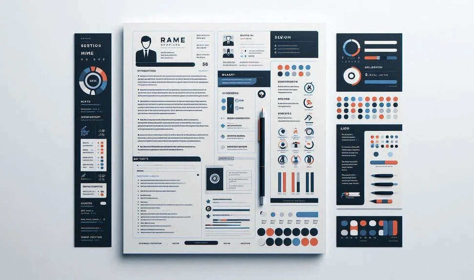
Design Principles for a Colorblind-Friendly Resume
When designing a colorblind-friendly resume, it's essential to focus on color contrast, palette choices, and layout to ensure legibility for everyone. Here are the key design principles to follow:
Use High Color Contrast
One of the most important aspects of making your resume accessible is ensuring that there is high contrast between text and background colors. High contrast helps ensure that the text stands out clearly against its background, making it readable for people with all types of color vision. For instance, using black or dark blue text on a white or light-colored background offers high contrast and is easy for most people to read, including those with color vision deficiencies.
Choose Safe Colors
Not all colors are universally distinguishable. While vibrant colors like red and green may look striking to people with normal color vision, they can be confusing for those with red-green colorblindness. To avoid confusion, opt for a color palette that includes colors that are distinguishable to most colorblind individuals, such as:
- Blue, yellow, and black
- Dark blue and light gray
- Dark purple and light yellow
Using these colors ensures that important sections and highlights on your resume are clearly visible to all readers.
Avoid Red and Green Combinations
Red-green colorblindness is the most common type of color vision deficiency, which makes using red and green together a poor choice for design. These two colors often blend together and are indistinguishable for individuals with this condition. Instead of using red or green to highlight or differentiate sections of your resume, consider using alternative color combinations, such as blue and yellow or dark gray and light blue.
Text Tips for a Colorblind-Friendly Resume
In addition to your color choices, the text on your resume is just as important in ensuring readability and accessibility. Here are some tips to keep in mind when designing the text of your resume:
Use Legible Fonts
The choice of font can significantly impact the readability of your resume, especially for people with color vision deficiencies. Avoid overly decorative fonts that can be difficult to read. Instead, choose clean, simple fonts such as Arial, Helvetica, or Calibri, which are widely recognized for their legibility. Additionally, ensure that the font weight (bold, regular) is used strategically to emphasize headings and key sections without relying solely on color.
Ensure Proper Font Size
Choosing a font size that is easy to read is essential, not just for colorblind individuals, but for anyone reviewing your resume. A standard font size for body text is typically between 10 and 12 points, while headings should be larger (14-16 points) to make them stand out. Adequate spacing between lines and sections will also contribute to the overall readability of your resume.
How to Test Your Resume for Colorblind Accessibility
Once you've made the necessary adjustments to your resume design, it’s crucial to test it for accessibility. There are several tools available to help you visualize how your resume will appear to colorblind individuals:
- Color Oracle: A free colorblind simulation tool that allows you to view your design as different types of colorblind users would see it.
- Sim Daltonism: A Mac-based colorblindness simulator that helps you test the color contrast of your resume in real-time.
- Coblis: The Color Blindness Simulator is an online tool that simulates how your document would appear to someone with color vision deficiencies.
By testing your resume using these tools, you can ensure that it’s easy to read and navigate for people with various types of colorblindness.
Conclusion
Designing a colorblind-friendly resume is a small but significant step towards ensuring that your application is accessible to everyone, regardless of their color vision abilities. By choosing high contrast colors, avoiding problematic combinations like red and green, and focusing on legible fonts and sizes, you can create a resume that is clear and professional. Remember, the ultimate goal is to make sure that your resume highlights your qualifications and achievements in the best possible way—while being inclusive of all potential readers.